Choose a design for our next theme, get it free!
Update: Voting is now closed. Design #3 is the clear winner so that is the theme we will be developing next! Thanks to all the people who voted and left comments! We will announce the winners in due course who will get a FREE copy of the new theme. 
Can I get your opinion?
I created a few designs for our next theme, and I’d like to know which one you like best.
As a thank you for your time, I’d like to give you a chance to win a free version of the theme just for voting.
Leave a comment below with which theme design you like best and a brief description why. We’ll choose 10 people randomly to get the winning theme design free (it will take a few weeks to finish creating the theme).
Images and text shown are just placeholders used for mockup purposes
Number One
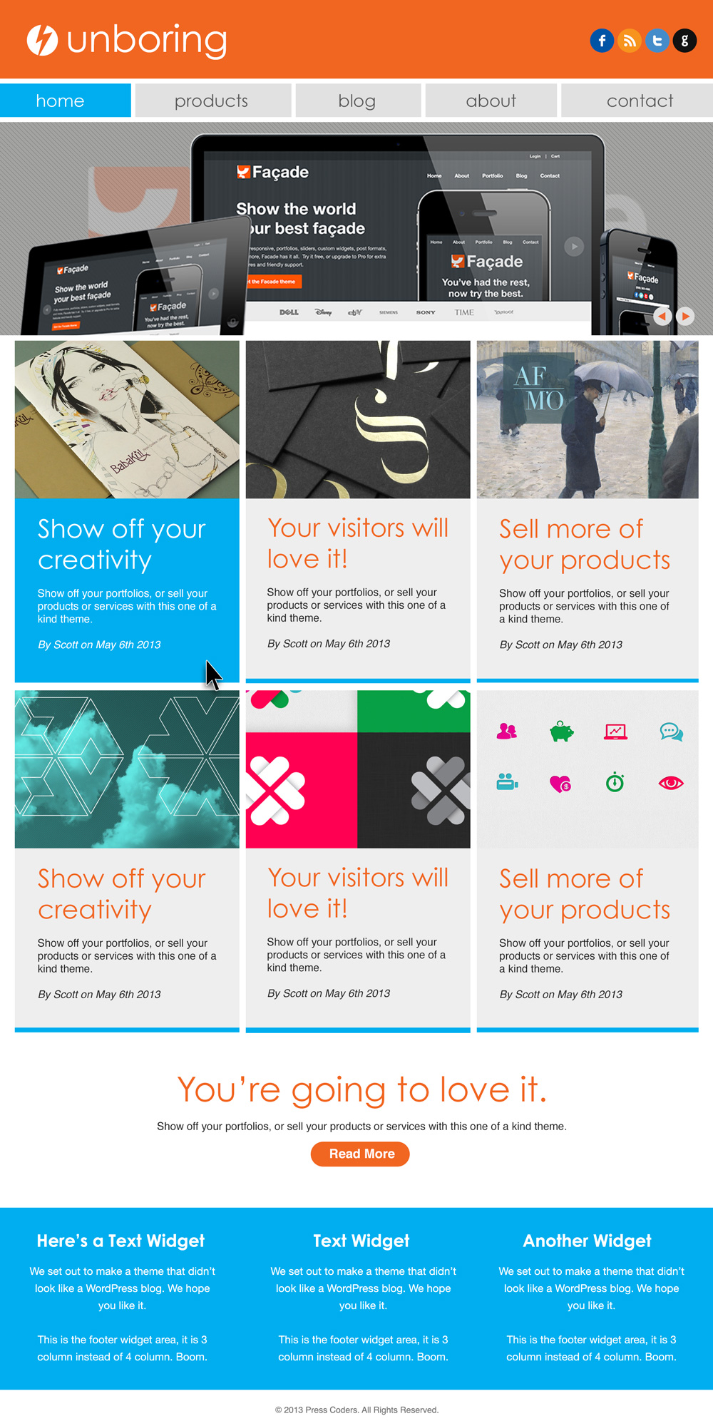
If you’d like to vote for the theme above, leave a comment with “Design Number One” and a brief description of why you like it.
Number Two
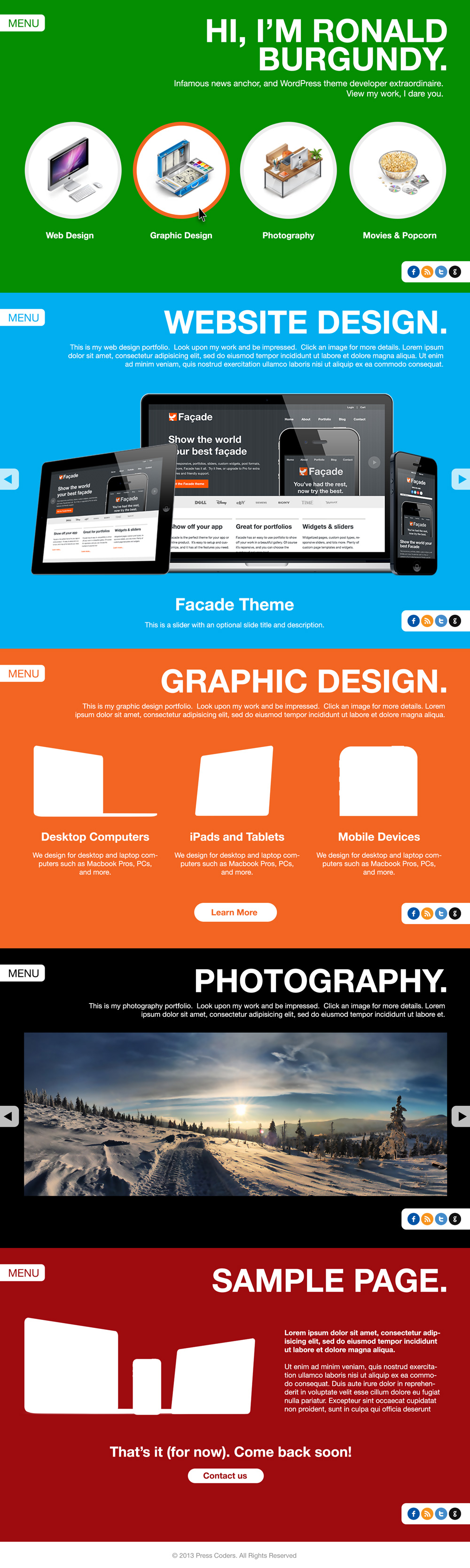
If you’d like to vote for the theme above, leave a comment with “Design Number Two” and a brief description of why you like it.
Number Three
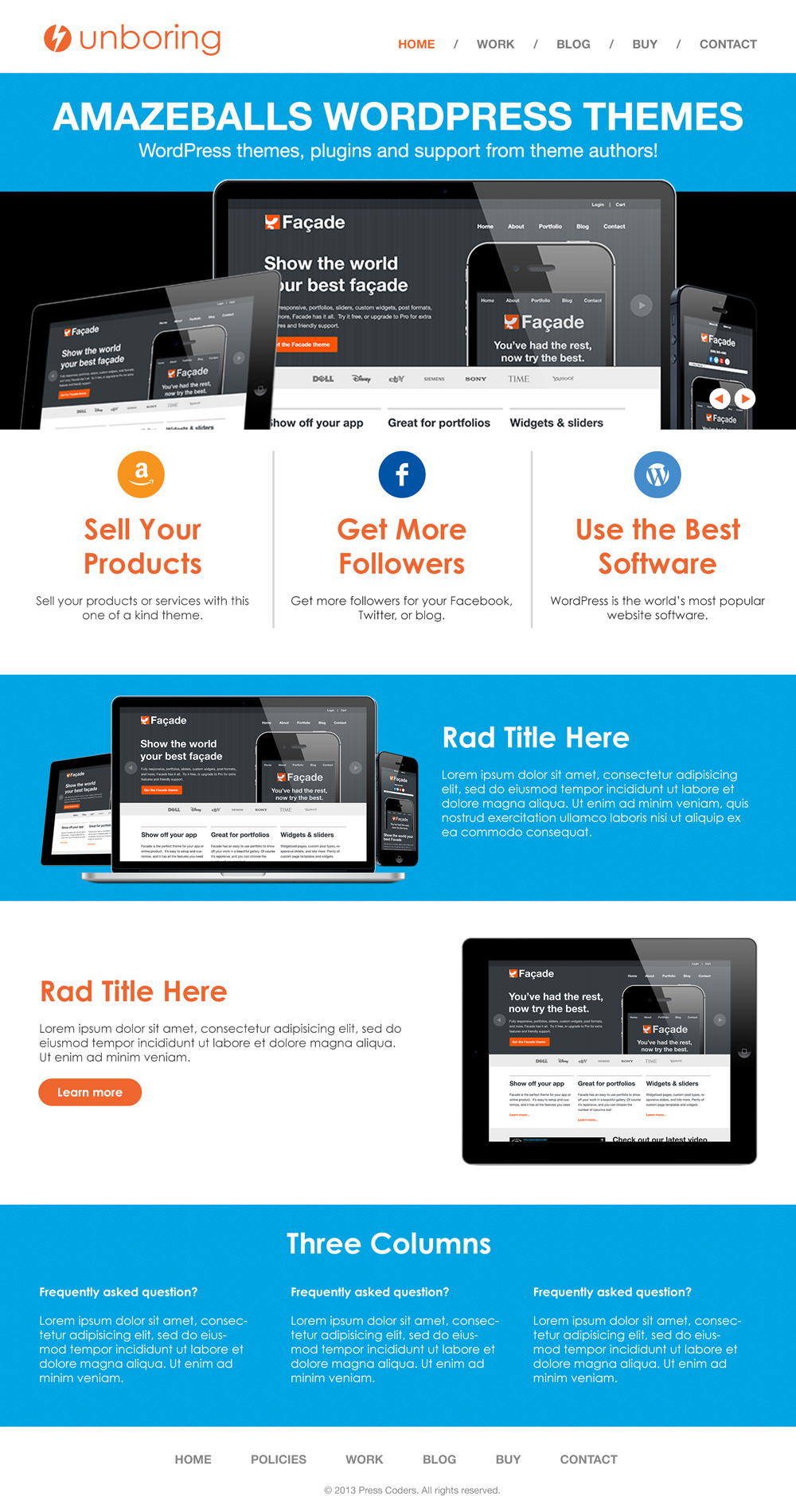
If you’d like to vote for the theme above, leave a comment with “Design Number Three” and a brief description of why you like it.
Let me know which one you like best in the comments, and we’ll choose 10 people to win it free!
Thanks for your time,
Scott
Update: Voting is now closed. Design #3 is the clear winner so that is the theme we will be developing next! Thanks to all the people who voted and left comments! We will announce the winners in due course who will get a FREE copy of the new theme.
Design Number Three by far… Smooth, plenty of options, modern look without being over the top. Looks easy to customize
Design Number Two!!! It looks totally different from most designs out there & I think that’s what people are looking for…to stand out!
Design #3 – simple look, not cluttered, good-size “main” image, like the placement of the tabs, doesn’t pile too much information on a single page.
I like number two. Loud and unique!
Design #3
it is the only decent one, relatively decent,
design #2: Is it a onepager or not? Color-mix is a pain for a grown-up-eye ;=)
#design #1: beside my aversion to blue-orange-combinations, it is so blocky that it hurts my eyes and I get no overview of the site, too distracting
so I must say, and you asked me, I do not like them all ;=(
In case I win donate it to somebody else or give me a choice for another theme of your themes ;=)
Cheers, Connie
Number 1 is definitely the way to go, cleaner, more balanced and more interesting!
Design number two, it looks totally different from all the themes available online either free or premium
Number 1: too boxy
Number 2: too big
Number 3: Very ‘Apple-y’ – Nice!!
I find #3 to be most attractive
I like #1 the best, nice and clean yet looks like some pretty cool options!
Definitely #3,
I also like the layout of #1 but it’s a bit “boxy” and bland.
#2 just requires too much scrolling to find out anything. I lost interest immediately.
I would have to go with Design #3, it is the most pleasing to the eye of all of them, not busy and appears to be the what I would think is the easiest to customize.
I like #3 too.
#3- Clean, simple, straight forward modern design.
Less is more. I think it has plenty to display the message and info you want to offer. And you could always build in more when need down the road. IMHO I believe this is where web design should be moving this year, trend wise.
It is responsive and mobile ready as well, correct?
Thanks for doing what you do, have a great week,
Ben
I like #1. #2 would fit those targeting Windows 8. #3 doesn’t look much different from what’s already out there.
Design #1 – nice compact layout, would like to see some different color combos and different menu
Design Number One. Looks modern, structured, easy to navigate. Nice color balance.
2 is too loud and too blocky for my taste, 3 is not as exciting as the other ones.
Love the first one, “Facade.” Very classy. Would be perfect for me.
Design #1: clean, simple, hopefully most of the boxes are colored through css, so easy customization and fast to load
I really like, number 1, it is clean and easy, hope it will be easy to customize.
First let me say how much I always love all of your designs! I’ve gotten the fitpro and coachpro and *love them* both! Design Number ONE is my choice between these three. Why? Because for me it is visually appealing right off the bat. It gives you a clean design with product/service choices upon first glance which feels easy to navigate through. Yep – Number One!
Thanks Becky, I appreciate it!
I pick #3
Design #3 was the most pleasing to my eyes…
I like design number# 3 the best!
Like everything in life, taste is subjective.
I could see uses for all these designs, totally dependant on the requirements of customer / business / product/s.
I quite like number 3. Maybe it’s just less fussy and that’s how i feel today.
Who knows about tomorrow though
It’s all great work though.
Alan.
Number three – cleaner and over all more useful.
Design #3 is the best..
# 3 looks to me like the most readable. Still I would include less stuff in there. You should aim for a clean (not overwhelming to a reader) look.
My choice is Design Number One. I like the whole grid thing and there are not many good-looking and useful grid-based themes (in the Responsive category anyway). Design number Three is a close second for a clean yet visually interesting theme.
Design #1
I find it the most visual appealing due to it’s organization. I like the boxy look and think it lets you display a lot of different content without distracting from anything. Great design!!!!
#1 is the best. The tile system is about as simple as it can get when it comes to getting a viewer to see what is all available quickly and easily. I think that is a main reason Microsoft uses it now. Plus because of that the look will be familiar to many.
The last one!
Number 1: loving metro style (I’m still undecided about which should I use on my site, I’ll pick that one!)
Design #3! it spoke to me more than the others 😉
I vote for number 1. I am working on a new site to support crowdfunding, and I think this would be a winner!!
Design #3 – clean / metro-esque and minimalist
number 2 is my favorite but the others are great to:)
Hi Scott — kind of a toss-up between one and three — but I guess I have to go with Design Number Three.
I know the trend is (and you’re on the cutting edge) toward pastel “only slightly coordinated colors” but I really don’t care for them.. In Number One I love the magazine layout, it is a bit “blocky”, as Connie said. Which is why i went with Number Three.
Again (you’re cutting edge) but number two makes me shake my head remembering those first websites that went on and on — on one page. I see what you’re doing — and like the “big button” navigation — but it’s gonna be a while before my “old school” head wraps around a one page site. But that’s just me. A lotta work went into these, thanks for sharing.
John
~.~
Thanks for your thoughts John!
Design Number 1. Clean with good white space.
I prefer design # 3. As a businessman, I want my key value proposition to appear topmost, with supporting material following. I prefer the straightforward look of #3.
For my vote I would go with #3 simple clean and would fit in with the majority of sites that I setup!
Although Site #1 I like the look of best but you would have to have the correct kind of site to fit it, you would have to have the same 5 set amount of navigation items any more and it will look odd. And with the blog box section you would have to have good images. With most of the sites I setup this isn’t always the case.
VOTE #3
I wandered through the pages … slowly enjoying the wealth of colour and possibilities.
I tried to feel … to taste …
So I found the confirmation of my first impression: # 1.
The why? A subtle strength.
That’s the real ‘power’ of this theme.
I choose #3. It looks fresh and flows the best.
Oh and Scott, typo in #3, says Design Number Two. Probably won’t make anyone vote for the wrong one but just thought I’d point it out
Design 3 is my favorite. I’m not a favorite of boxed designs (like 1), because it really limits you to customization. If you’re good at concept design, design 3 is the way to go.
Number 1. Perhaps because I am looking for a portfolio theme, but I like it.
#2 !!
!!
Are you a child of the Flötotto aera??
Let go of the intellectual building bricks athmosphere shit.
Forget about them and start a temeplate which is easy going.
😛
Nice!!
Design #3 Its clean, clear and easy to understand. It can be adapted well to many different types of sites. #2 is TOO simplistic but would be nice for a simple product. #1 is just a new version of a grid. Its not bad, but its been done.
Number 2 is simple, easy to read, clean and probably is the easiest to make accessible.
I like number 1 as it is simple but allows the user to see other columns of pictures/subjects that would be interesting. I look at this from my POV which is running my own consulting business which may be different from other my artistic or creative businesses.
Design #1 – I’m a sucker for clean boxy designs, plus I just love the colors and the way the nav/header all fits together. ^^
#2 seems to go for windows 8 platform which is extremely unpopular right now/sinking ship. #3 I believe is the best out of the three because of its streamlined design and (of course) simple mobile platform.
I’m torn between 2 and 3, but for my business I think 3 would be more effective (but I really love the boldness and simplicity of 2).
Number 1; most similar to a Coyier-esque design
Number 3. Simple, clean, intuitive – all the tools, too.
#3 is the best!
Well when you look at things from a DESIGNER perspective all of them arepretty amazing andwould fit a specific company differently and having said that, I’d pick Design Number 2. It just suit’s me better, besides the fact that it’s clean, outstanding, unique and simply awesome!
On first glance, I really liked number two, but after coming back for a second look and mulling over the subpages, I prefer Number One. All are very nice, and Two might be a good choice for certain specialty sites, but for a general purpose site I really like Number One. I like the organic feel of it; it’s very cohesive from top to bottom, the subpages complement the homepage, and the whole site feels elegant, stylish, and well thought out, without being so obtrusive that the design might compete with the content.
Design 2, because it’s versatile for a variety of solopreneurship businesses and can grow with the entrepreneur’s product offerings as she/he creates more.
Design Number Two : The design come up with cool design. Good Work
Number 2 – Slightly Querkier. Reminds me somewhat of game dev the video game.
I like the 2nd one because of its design, color combination and creativity all together and above of all it looks very modern.
#2, the scrolling design is unique among commercial themes.
Design Number 1 – great clear layout displaying significant proportion of site content on first page drawing users further into the site. Flexible nature of design can be applied to different business types and purposes.
design number 2, for sure. it looks like it will scale nicely for different screen sizes. it also looks like the circular menu options will auto-scroll to the appropriate page sections?
I like number one. It’s simple and straightforward.
Hey Scott,
It’s a toss up between “Design Number One” and “Design Number Three”, but I’m leaning towards Number 3.
It’s clean, visually appealing and flows nicely. Great work! Look forward to more beautiful designs…
I like #3 as I think it’s a more modern take of #1, still pleasing to the eye, just more modern feel.
Design Number 1
Because the menus are front and center and large enough for me to see without squinting. The main graphic is the right size for someone that is not a photographer and the subsequent areas large enough to be an interesting tease as well as pleasing to the eye. Nice work!
Hi. I like #3 by far. Lots more options and smother looking design. I’m thinking the other 2 have potential, but if I had to choose between the 3, I would purchase #3 before the other 2.
Design number 2 # I love it !
Number One is my favorite. Very clean, simple and modern. Great layout!
Scott, as always I’m impressed with the work that you and David continue to churn out! My choice would be Design #3! It’s not overly busy, has a beautiful layout and presents a web sites main points/intention in a clear, concise manner.
Thanks Jayson!
I would go with design #2 because of the visual focus, it’s simple and the minimalist approach makes it intuitive, especially when using a smartphone. Of course the template won’t work with all business platforms, so one would first have to consider the Programs, Products or Services being offered. This is a refreshing approach to website design!
I like the simplicity of Number 3. The menu bar on Number 1 is a little too boxy. I like the kind of quiet efficiency of 3’s layout: simple menu, slider, three main sections below, and addition room below – very easy to navigate. Most of the important information will fit on the main screen without scrolling.
Scott, as always I’m impressed with the work that you and David continue to churn out! My choice would be Design #3! It’s not overly busy, has a beautiful layout and presents a web sites main points/intention in a clear, concise manner.
#2 Looks a little bit like the sims video game to me. Very clean and and seems easy to ready and powerful
Websites are changing. They are no longer “Look at me and what I do” –
People have got bored with company boasting and don’t read these any more.
So companies have responded with Content marketing, which creates articles,
infographics, videos, slideshares etc. which are of more interest to the person
searching for something.
A lot of this is done on social, but the web as a hub needs to reflect it
too.
Something closer to a magazine layout is needed. With a customisable space
you can move around (widgets) with scrollable articles, video and links to
live feeds from Twitter etc.
Scrollable presentations would be good. And ideally a wiki where you can ask questions and be more interactive.
I’m sure you have lots of customers who just want the “We do this” site but
creating a truly modern site would make you stand out. And be worth a
premium.
So my answer to your question is none of the three.
But please let me know when you do one like I’ve described.
Hope that helps.
Peter
My top vote would be for #3 followed by #1 and then #2. I think the white space in the third option lends itself to a cleaner design.
As an artist, I am leaning towards #1, as a way to show multiple images at a glance, without a lot of scrolling.
hello scott,
I think #1 is the best. Once again, I suppose it all depends on what the site’s for… The 2nd theme’s colors are a bit off, but structurally I think it’s solid.
Theme #1 is probably best for a site that is generating content often. The other structures may be more useful if the site’s content is pretty static.
“Design Number One” is the design I’ve been waiting on to complete my website the way I always wanted it. I want a clean, classy look and design number one can really give that in a simple way. I really hope I win the design. Thanks in advance.
I like #3 the best, nice clean layout,
It’s number three. I really love the clean look, and it’s got a beautiful balance of white space.
I prefer #2! It’s clean and imposing at the same time. What you can’t say on a big front page teaser is not worth selling. People can dig deeper if they want to/get curious.
Jan
I think number 3 as It’s much cleaner design and have a much better appeal.
Hi Scott,
I like nr 3 best. The overview and more cleaner design.
Paulien
I like design number 3 because looking at from an ecommerce platform point of view this theme would be the editors choice pick, hands down.
I like all three and can see them being implemented for a few projects coming up. But my favorite is design #3. Aside from the chuckle I got from Amazeballs, I like the clean look we could achieve by dropping the blue (or any color) and going all white. Love the slider, clean header and simple footer. Would be interested in seeing the mobile version too. Great work as always, PressCoders!
Thanks Manny, you’re amazeballs! lol
Design Number Three looks awesome!!! I can’t wait to see it live in wordpress. The design is more tuned to the common requirements of any designer and the clients.
Number 1.
You can do a lot with it and it’s flat which will be the around for a bit.
regards,
T
I think number 3 is best! Because of the clean, simpel and powerful design! Number 2 is a little too big and also the colors are a pain for the eye. And the first one, is also pretty nice, but too boxy and to much stress.
greetings,
Ruben
Design number 1 is my choice because it provides the proper ecommerce platform to display many products and give freedom to customize. Sign me up!
I like #3 – but I tend to like less busy sites.
Design #3, it rocks!
Number Three. Seems to flow better than the rest. At some points I couldn’t tell I was still on the same theme for numbers 1 and 2.
Theme #2
I like this theme as its unique and like a roll of film, everything happens on one page, this would be great for prospects who want to simplify their search and just scroll through. Great to view on a smartphone. Nice job on this theme Scott!
Thanks Elliot!
3 combines the best of 1 and 2. Most clean and easy to read.
Number Three is the one i liked the most… I would use it on my projects with only minor tweaks.
I vote for number 1.
Much more interesting then 2&3
After looking at all of these designs, I think I would also have to go with #3.
Though I would drop the blue and go with a different color, I think it’s the best option.
Would also, like to see a mobile version.
Thanks
Design Number Three: Looks easy to navigate, clean and appealing
Design # 1. Love the way you can organize everything on the site and its modern new look.
Number 1. I like the flat blocks, which when used well can be flexible and lend itself to a number of different uses. Can be as busy or clean as you need it to be.
Number Three: simple with elements my clients ask for in their websites.
Design No. 2 is my favorite. It is refreshing to see something that stands out from the rest.
#3. It’s simpler and clean.
#1 gets my vote.
Number 1 – but for me it’s all about how easy it will be to customize.
I vote for design 3. More natural flow of layout and arrangement of columns.
#3 is the best!
Number 2 – super flexability for myself and my clients. Great Look
Number 2. Simple & clear design
I would choose between 1 and 3, 1 looks more modern to me, 3 is presenting a more conventional look, For my own business i would take number 1 because it offers a lot of opportunities to present my business in a different way than i normally would do in a layout like 3. Its more surprising to me, it has a fresh look
Number 3 – was very eye appealing with the changes from blue to white in the background and it wasn’t too lengthy….I liked number 2 but it was too long. When looking quickly at things, I like info short or to see everything right at the beginning.
Clean, looks easy to navigate. Would like to see a site map.
Number 2 is very different, but a little busy. so I think number 3 is my choice as it looks more professional and clean.
I would vote for the Design Number 2.
Simple, colorful and elegant.
I say the same thing Anna Doelle
Design Number Two!!! It looks totally different from most designs out there & I think that’s what people are looking for…to stand out!
Nunber 3 clean design easy to read and find your way around
#2. I’m an actor and I could totally use that!
Number 3 hands down.
I vote for number 3. It’s clean and more professional than the others with just the right amount of white space. It’s also clear – easy on the eyes for better navigation.
I like number 1 – it’s well-organized and visually appealing. Thanks for asking!
Design Number Two – Simple, modern and to the point.
#1 design is better and more adapted to touch screen. A nice view of Web 3.0
I would have to chose #3 because it looks to be the most visually appealing. I presume the framework would be the same for all of them, so it comes down to layout and appearance. As they stand right now #3 has to take it.
#2 has a LOT of potential and could be my top choice because I love the idea of the image bubbles as menu choices. But it seems like you used different color options for the rest of our example on #2 so it looks massively out of place. If you put the same theme up, but actually used a single color scheme on all the page and section samples, then I’m likely to have voted for 2…. it seems to be a lot more “fun”.
My favorite is #3!
I like #2
Simple but very eye catching
I like #3 best. For me it’s straightforward, simple and easy to follow. It looks easy to set up and customize as well. It looks modern and professional which is a big plus, too.
Definitely #1 !!!
Boxy and with blue & orange – what else do you need ? A very modern and cool looking theme.
Hey!
As it has already been said it pretty much depends on the purpose for the site.
My personal favorite is #1 because use of its originality. #2 is pretty big and huge for ordinary visitor’s eye and #3 is overused worn out design present on every second modern site…
So that’s a brief view from me 😉
Number 1 for me …the most understandable.
Theme #3 is awesome
Really like no1, its different to a lot of WP themes, there is a lot of potential in my view on that. Really like it. Not sure on 2. Really Like no 3. If I had to choose a favourite…it be no 1
Design Number 3, close between number 2 as I like that multi-layering as you scroll down. #3 just does it that little bit better …
Hi Scott,
I love Number Three.
It is well set up, clear, easy to read and has got a good mix of words and images.
Hi, I liked the 3 designs. The one I liked the most was the number 1, now if you could remove the author and date would be great.
As always all your designs are fantastic. I work with 2 of yours
Thanks scott.
Thanks Andres!
#1
It looks crisp and new and yet maintains enough traditional aspects to not be intimidating. #2 is intriguing, but I am not feeling drawn to it to represent me. #3 is ok too, but I like the sharper look of #1.
Great job!
Thanks Deb!
Hi Scott and David hope you guys are doing well.. it appears business is good!! I really like the second theme it is so colorful and intuitive. Just my $.02 I hope it helps!
Wheeler
Design number 3 is fantastic. Cool and slick.
Wayne
Design number three.
Simple layout. Not cluttered. Good color scheme.
Design Number Two….bold and simple!
Design number ONE is my choice because of its simplicity and clean design.
Number 1! It is clean, with the right graphics it will flow and is pleasing to the eye. Reminds me of windows 8. Fresh and new.
NUMBER ONE is my favourite. A great mix of design and colours. number two is a bit heavy on the colour blocks. and number three is a slightly weaker version of number one but still nice and clean. I am about to create a new wordpress website and I would like to use NUMBER ONE. Thanks, Anthony.
I really like the colour scheme, menu style and layout of Design Number One. Design Number Two would be great for portfolio sites, although you’d need to alter the green background and graphics to make the home page more appealing. Design Number Three would probably work well for more corporate websites. All three designs look good and but my vote is for Design Number One as the best multi-purpose theme. That’s my tuppence worth!
Number one would be my choice as it’s fresh layout and design caters to the more current online viewer using the internet today.
I would say Design 3. I like the smoothness of the design, but also like the second menu placement at the bottom of the page. Others may already know how to place there, but for me it could also be a great place to hide different bonus pages for those who look at your entire page.
Thanks.
1 or 3. They are OK. There is nothing that would make me say WOW I like it. In my case I am always looking for interesting widgets, new functionalities so I can re-skin specific theme. Anyway good job.
Hi Scott,
Thanks for asking for feedback. Here goes:
Design #3 is great–very clean, easy to look at, yet eye-catching.
Design #1 is next best.
Number 2 is great! A more unique design! Bold and simple
Design number one. A good balance of clear navigation and simple design going far. Design number two is also very interesting, but the front page navigation with the circles I’m unsure on. I think both could be used to create some very worthy websites.
Design No. 3, because its fresh, clean and simple.
#3 Design looks good =)
love #1, clean & i would buy it!
Design #2. The pages looked cleaner . Not in the design business but the others looked like a lot of work both in design and navigation. Front page nav is fun and funky and graphiceeee . It just works for me. If I win I’d like this one please:)
Congratulation! You just developed miracle themes. good idea for marketing.
I like all themes.
but, i will choose number one when you have to choose to me because it is cool and look like e-commence style.
Design Number Three. The lay out is clean and the color combination is appealing.
Design Number Two
Hmm, difficult decision between 2 and 3. Number 3 looks good and it seems one could use it very easily. Anyway, you want to make a new theme and therefore i vote for No. 2 because it is so different to usual themes. Your customer might have to think a bit longer, how to use the theme in a effective way. But if customer is creative, he’ll gain good benefits from this theme.
design # 1 is the best 1 for me. looks professional with easy eye catching navigation…sure to make the visitors go to inside pages (rather than saying bye from home page itself) …good work
First of all, congrats for your creativity and passion.
# 1. It reminds me the Metro Style of Windows8. Anyway it is interesting.
# 2. Risky, audacious, brave and creative. Personally, I like it, but many people could find it uncomfortable to navigate.
# 3. Clearly, the classic one. Simple, effective and efficient.
I think #3 is the most “flexible” and could fit a vaste range of projects. I appreciate its clean and fresh feel, event if the typography is a bit too basic (it could be improved, in my opinion). I also like #1, for the same reasons, but I think it could fit only some kind of projects (sites with a strong graphic feature, for instance). As far as #2 is concerned, I think it has some pros, but I hardly can figure a client that would ask me to use it for his website. Probably, most of my clients are traditionalist…
Nice work, however!
“Design Number Two” – this is the best of the three IMHO for clearly promoting the distinct areas of my training business. (I currently use your CoachPro theme). The distinct separation of sections allows each core area to have space for distinct promotion, rather than just a different column of text. Your use of colour in the boxes makes it visually easy to navigate, so a new visitor, once going “below the fold” won’t waste time finding the area for them, so probably increasing click through and conversions. So for me, “Design Number Two”, would be a great way to forward. Although happy with CoachPro, I’d be interested to see change of traffic behaviour from using “Design Number Two” theme.
i would like number one because it is perfect for 2013 templates. i think that your marking system is good for do that.
good luck you and me.
Design Number Two – it’s very different from anything I’ve seen before. Fresh and bold.
design number two looks unique and simple unlike most themes, i love it
Well, I think number three is a good business theme (like cyberchimps’ ones?), number two a very creative one, (I would choose it, if the background color can be changed), but number one, with its pinterest touch, seems more flexible and ideal to be customized. Number one is my vote.
Number 3 is my favourite as it is classical simplicity and the style of the pages seem to flow together
Number 2 reminds me of the posters seen in schools all the time, while number 1 seems disjointed.
Number 2 – looks like a theme that could be developed into a quick but fun small website
# 1
I love #1!
I like Number 3
I would go for #2
Design number two!!! It seems to look super at mobile devices!!!
DESIGN NUMBER THREE / (3) / (III) gets my vote. I manage several sites and I tried to envision suited up in these templates. Number 3 seems to be the most versatile in terms of meeting my needs. The others are too “blocky” for my concepts and tastes. Number 3 feels better, fits better.
ALSO PLEASE NOTE – Number 3 may lose votes to number 2 because at the bottom of Number 3, the copy tells you to leave a comment that says: “Design Number Two.” If I were design number 3, I’d lodge a protest.
Thanks for spotting that Mike, I fixed it. Can’t believe I didn’t see that before!
I did send a comment about just that yesterday…
I don’t really love any of them. Design #1 is too boxy. Design #2 is appealing at first glance (except for the color) but quickly gets boring. Design #3 is the nicest of the three … I could see myself using this design.
I like #1 best. It is very business-like, easy to maneuver around, straight and to the point. #2 and #3 seem busy and not as easy to immediately identify where you want to go on the page. I like simplicity… perhaps it’s my age, but yes, I like simplicity~!
I like number two. I think it be be great for the mobile platform. It’s also seems quite unique, which is hard to achieve these days.
I like #1 it looks very professional and seems like it would work for a variety of niches.
I Like Number 3
It’s clean and simple. I like the fact that it is business oriented with the buy button meaning it can be used as a Web store. e-commerce.
Design #3 is the better of the 3 designs presented. It is simple and clean. The single main graphic works for most user/client needs. It gives you the option to drive viewers to the content that they may be most interested in with the 3 column portal-style navigation under the main graphic. I will say that I think that your themes are missing the ability to let users with logos really customize the banner or main area for their logos. It appears that your themes cater more to those that dont have logos, which makes it difficult to incorporate really good logos in your themes.
Hi Angela, thanks for you comment! Actually, all of our themes have the ability to upload a custom logo
Number One.
I vote for No. 2. I want to sell books; Social media is the biggest factor for me, and No. 2 has the social media icons placed prominently. Very important to me. Plus it looks great. I think it’s fabulous and would love to use it and be a big proponent of it.
I like Design 2 – with definite color and spacing adjustments
I vote #1
Follow up #3
I would vote for the first theme as its colour combination and lay out
appeals a lot.
I vote for Design Number One. I like the colors and the box lay out.
Design Number One.
The design was the most visually stimulating of the three, much easier to take it all in as compared to the other two designs. I also liked the fact that the visuals were broken off to smaller areas like the Windows 8 interface. No said that Windows 8 did not look nice, the complaints were mostly on its navigation. Number two was the opposite, big chunks and less appealling visually, plus you had to scroll down more which would drive away anyone looking for instant gratification.
DESIGN HUMBER ONE
I love number one, it shows products front and centre, with great teaser headlines and just enough copy, it is hard to choose as each use will be different for the end user. I want to sell paintings so 1 is fantastic for me. It all hangs on the customisation of colours and widgets. Would be great to have a gridlike photo widget also with headline showing other products available once in the post page.
I like #1 because of the colors, option to add a portfolio, blog and sell online. The other themes didn’t catch my attention. I am looking at selling canvas photography so this would be a viable option that could catch potential buyers attention. If I were selling products may be inclined to use theme 2 because of the unconventional way it highlighted items. Number 1 is the best for me though.
The 3rd one is nice and clean…. Best Choice
Design #2
A fabulous design!!!!
Although I liked the striking colors of #2, I have to pick #1 for its layout.
I like #3. It’s well laid out and looks organized. Main photo gives you a good idea what you’re looking at. If it has an editable caption and button on the flex slider AND the site is responsive hopefully when viewed on a mobile device you’ll code the text and button to shrink with the photo. Too many themes cut the photo off to focus on the text. Also, would be awesome to have options for column and rows of widgets on the front page! Looks good.
I like the theme #3. It’s clear and simple. The readers will find what they need easily.
I really like design #3. It looks clean and not at all like a wordpress powered site. Can I get a version for my birthday? I’m a big 30 on June 6. yaay!